
Table of Content:
Designing a Dashboard
Layout and design
Filter Actions
Formatting
Publishing
Design your own dashboard
Deliverables
Design a dashboard with a minimum of 4 charts/graphs that tells a story of your investigation of the lobbying data. Publish your dashboard online.
Dashboard design
In this assignment, we’re going to go through an introduction to building out a dashboard. Dashboards can be used in publishing visualizations also just to show fellow reporters and editors the data in a way that helps explain the data for a story.
First, let’s open up our workbook from last time:
You’ll click on the dashboard icon to create a new dashboard.
Double-click on the words Dashboard 1 and you can rename your dashboard. Let’s call it WA-lobbying.

When you create a new dashboard, you’ll see that you now have a blank canvas on your screen.
This is similar to what the normal workspace looks like in Tableau, with a key difference.
The measures and dimensions are gone from the left -hand side of the space. Instead, you have the names of your sheets.

This dashboard has a few other key features.
The middle is a canvas for your to place your sheets.
And Tableau provides tools for designing or laying out the way your dashboard.
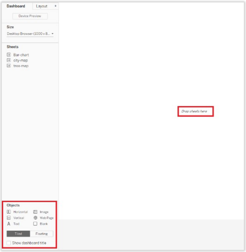
We will start with the tree-map. But first, let’s make sure we understand what this tiled layout is about.
Tableau provides by default what they call layout containers. The sheets that you drag out will essentially go into these pre-designed spaces or containers set up by Tableau. So, for the tree-map, make sure you have selected a tiled layout and that you have also selected horizontal

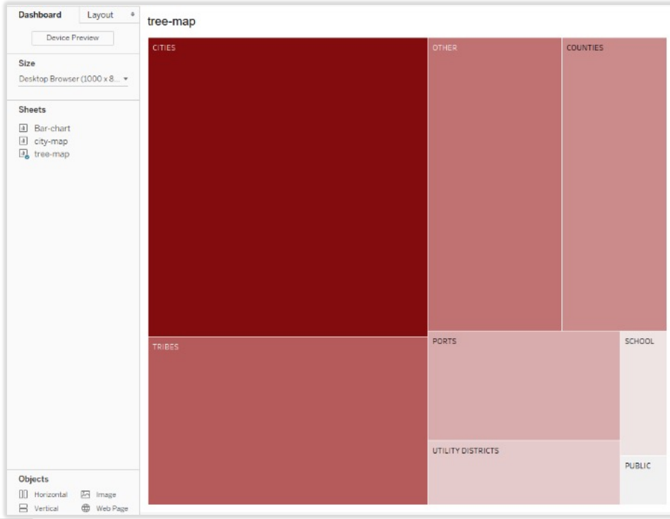
Click on the tree-map sheet and drag it into the main workspace.
It will automatically take up the top half of your screen.
A legend will be placed to the right side of the tree map as well.
Now, drag out the bar chart. This can get a little tricky if you just drag and drop.
The chart may end up being set up vertically next to the tree map and that just won’t work visually.
Drag and drop it on the bottom half of the screen.

Now, you have the tree map and the bar chart on the dashboard together but we have a ways to go before publishing. Some of this we will adjust in the dashboard and some in the worksheets.
What items can you see that you would like to present differently?
By default, Tableau will show the sheet name on the top left of each chart. But I don’t want my tree_map to simply say tree_map. So, I am going to double-click on the word tree_map in my dashboard. You will get a pop-up box that looks like this:

<Sheet Name> is Tableau’s way of telling us that it is passing through whatever the sheet name is into the title. We can either change the sheet name, or just delete that from the Title text box and type in the title we want. I’m going to take that out and put this: Lobbying expenditures by organization type.
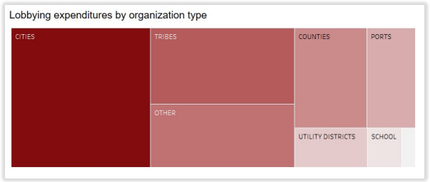
Now, I don’t even need a title for every chart. So, let’s just delete the title from the bar chart and for the legend too. Let’s look more closely at the bar chart. It lists entity at the top and then each field says what the entity is. But how do we remove entity – that’s the name of the field? Use a control-click, or right mouse-click and you will get a drop-down box. Select Hide Field Labels for Rows.


Now, let’s create the filter action.
Select the caret on the top right corner of the tree_map and then select Use as Filter
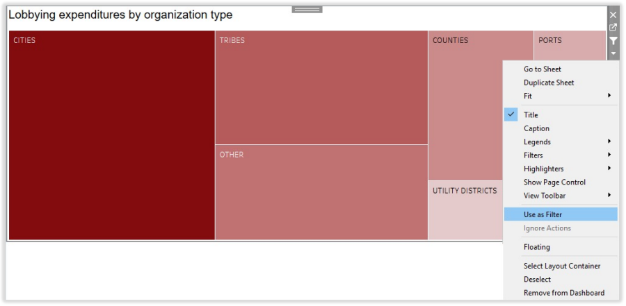
Now, when we select Cities on the tree_map, the bars in the bar chart below also change to just display the cities.
Select Ports and what happens?
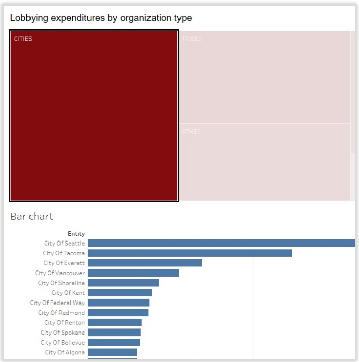
Go to the bar chart worksheet. Several filters are limiting what can be seen on the dashboard.
The most limiting filter and the one that makes it so only cities and counties are visible is the one for population because the only fields that have population in the data are cities and counties.
Remove all the filters and make sure that the bar chart shows the total spent by each entity.
How else can we improve this chart for the Dashboard? Make your own modifications as you like!

Color choices are important for each chart and so is continuity of color themes. So, let’s make our bar chart colors match our tree map colors.
Select the color icon on the marks shelf.
Then click on more colors. Go ahead and match the colors to the tree map. It doesn’t have to be exact. As long as it’s in the same palette, it should be fine.


We’re not done tweaking our bar chart yet though. Let’s also take a look at what shows up on our tooltip and adjust that.
Click on the Tooltip box in your marks shelf and you will get a box that pops up. It looks like this:


There is another change to make in the formatting of the total field. Remember, we are talking about dollars and cents. Let’s convert the format to currency. That way, the dollar symbol will show up when you hover over the bars. To change the format:
Click the Total pill caret
Select Default Properties
Select Number format
Select Currency

Examine this before and after of the tree_map tooltip.

Let’s do the Dashboard one more time. This will give you experience going through the steps again, but we also will format the dashboard a little differently this time around.
You’ll click on the dashboard icon to create a new dashboard again.

We will start with the tree -map again. But this time, we’re going to use the Floating format for the Dashboard design. At the end of the day, you can decide which formatting method you like best.
Select floating and select each of your sheets and drag them where you want them.
Your tree_map sheet will also come with a legend, which you can move around on your dashboard. You can size the sheets on the dashboard by hovering over the corners and edges to drag those in or out.
Now repeat all the steps before and drag graphs to create a Floating dashboard.

Phone View Dashboard
So far you have created a Default dashboard to be viewed on a laptop or computer. Now, create a dashboard view that will be optimized for a mobile device of your choice

Re-arrange your graphs to fit according to the new layout. You can choose what to display and what not to. Its your decision to present the dashboard that covers what is important.
Tableau publishing Finally, we want to publish our work for the world to see. We will use Tableau Public.
To publish, select Server/Tableau Public and then Save to Tableau Public As…:
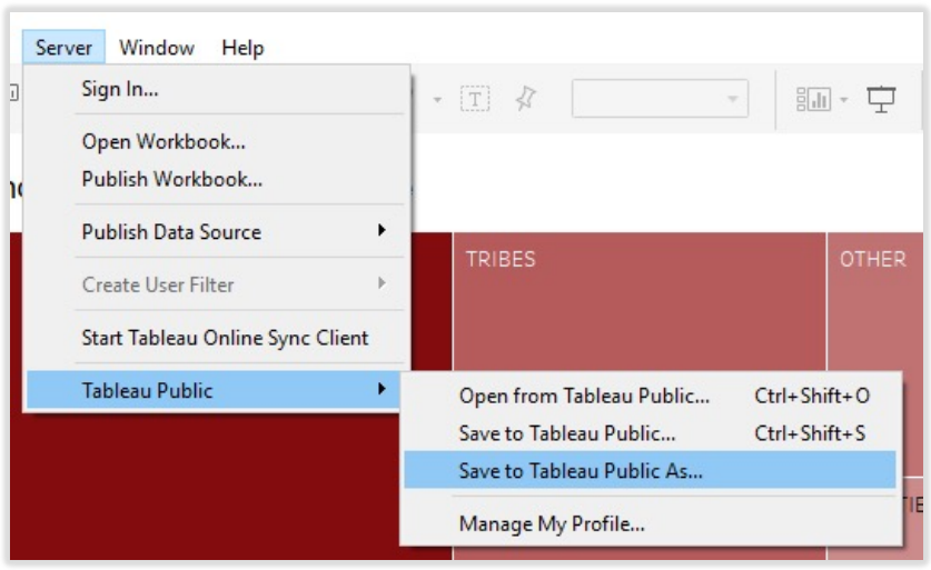
You will be prompted to sign into your Tableau Public account.
Go ahead and do that. You may need to create a new account at this stage if you don’t have one.
Use your UCW details (i.e. UCW email) for your profile

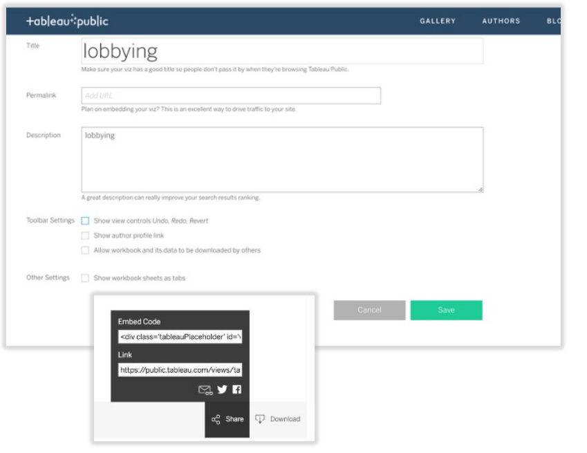
Name your new published viz and add any description you would like.
You can also then copy a link or an embed code for your visualization.
There is more you can do with your profile on Tableau Public.
To get any help related to Tableau Visualization, Tableau Dashboard Design, Tableau Assignment Help, Tableau Homework Help and more other, you can directly contact us or send your project requirement details at:
Comments